Visual identity · Pyrenees
An identity born
from the landscape.
Pirynaicus builds a visual world around the Pyrenean brown bear, its habitat and the experiences that bring people closer to it through respect and conservation.
The identity is rooted in the landscape: restrained, organic and textured, evoking matter, traces and the passage of time.
01 — The symbol
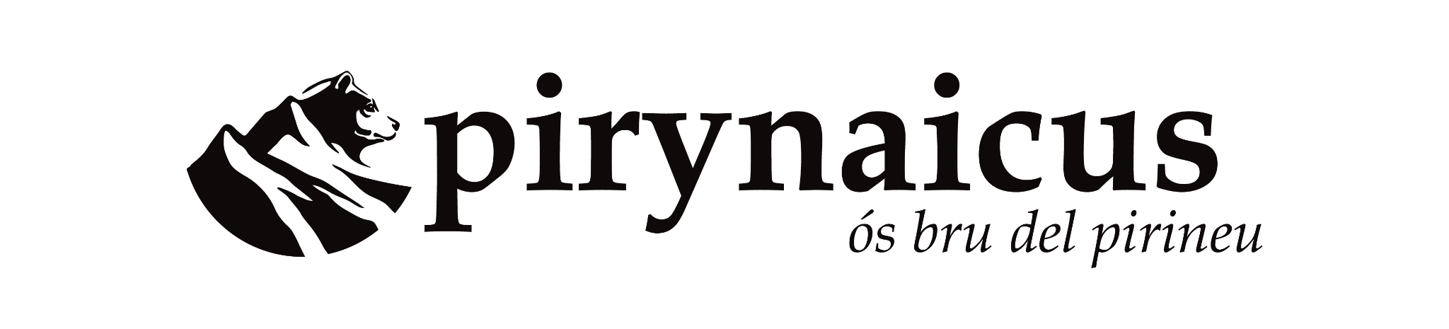
The bear becomes the centre of the system: a recognisable figure reduced to planes and strokes, able to work both as a signature and as a graphic device.
02 — Visual voice
Editorial,
tactile, natural.
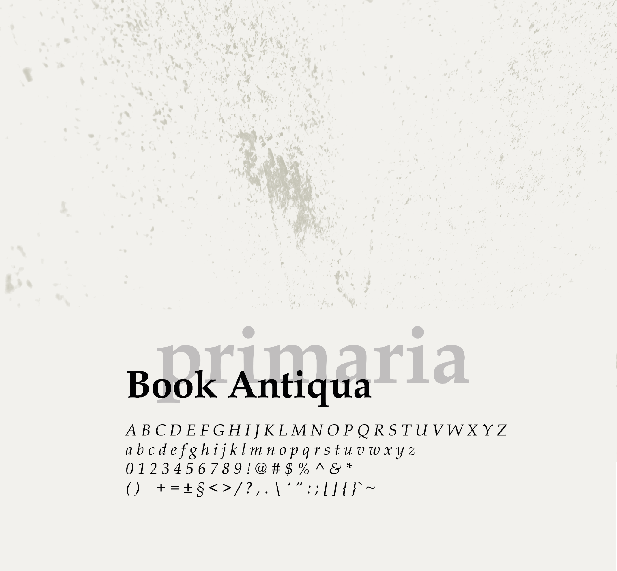
The serif typography brings an editorial, timeless tone. Imperfections and texture soften its rigidity and connect it to the landscape and a more human voice.
03 — Colour
The landscape turned
into a palette.
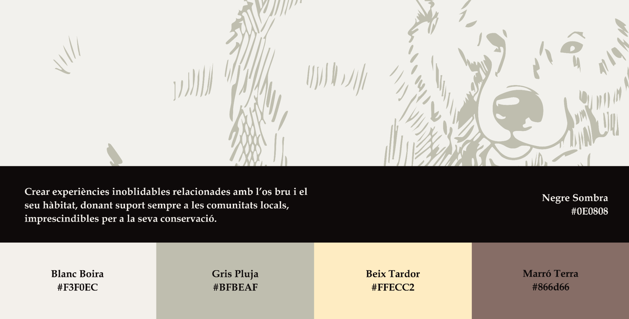
Fog, rain, autumn, earth and shadow. The tones come from the environment, keeping the identity restrained so photography can take the lead.
04 — From system to landscape
Landscape and
wildlife.
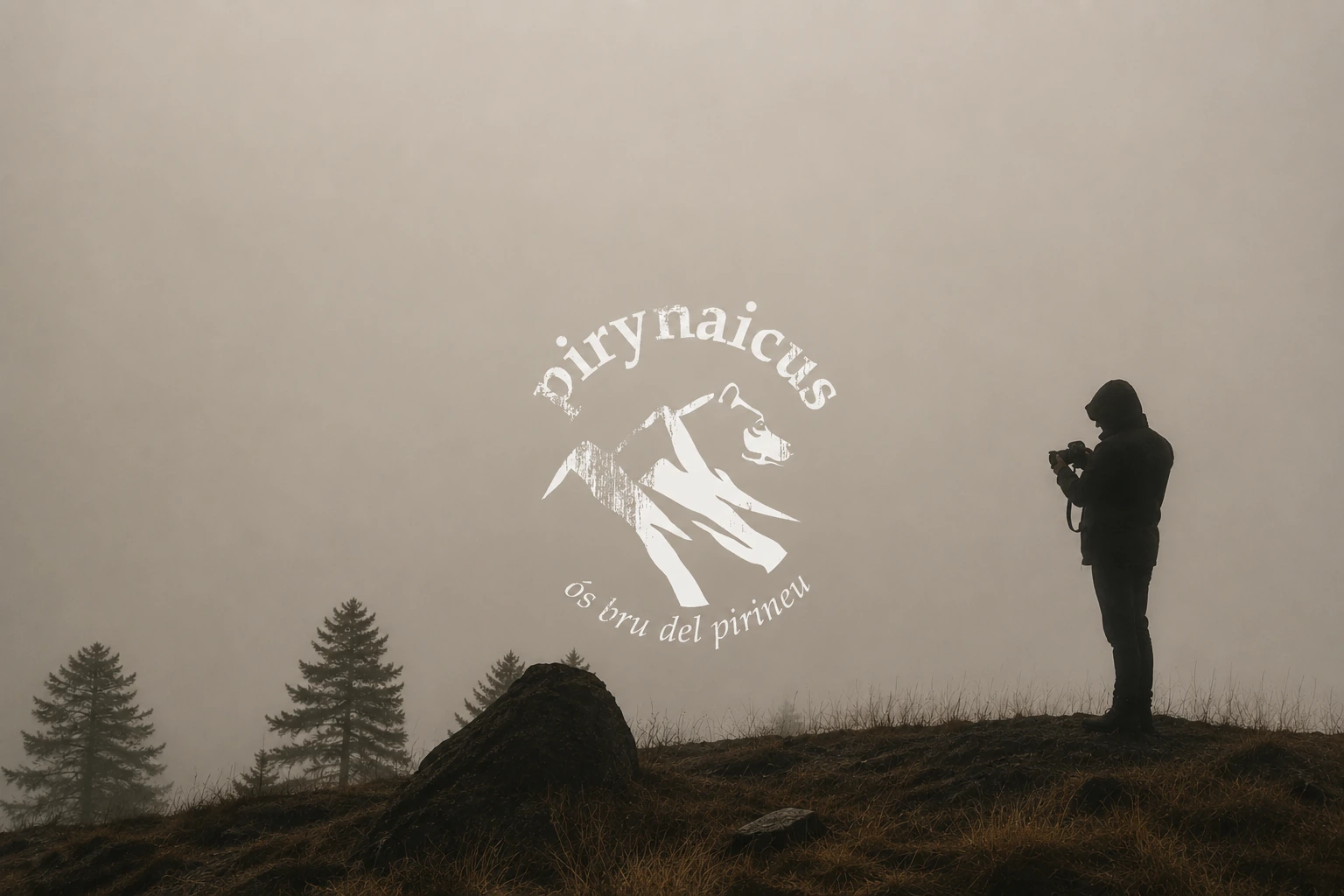
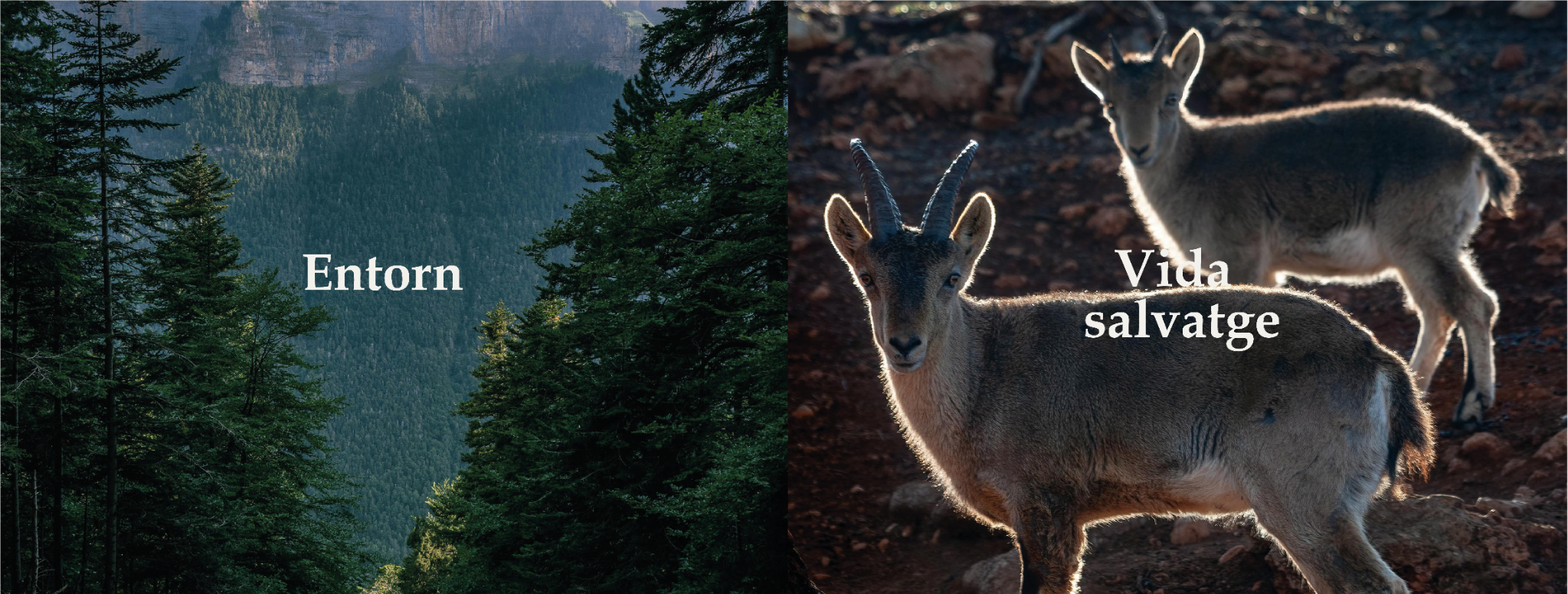
The identity lives alongside documentary photography without competing with it. Typography and image treatment organise the story and connect landscape, wildlife and experience.
05 — Communication
A language built
to tell stories.
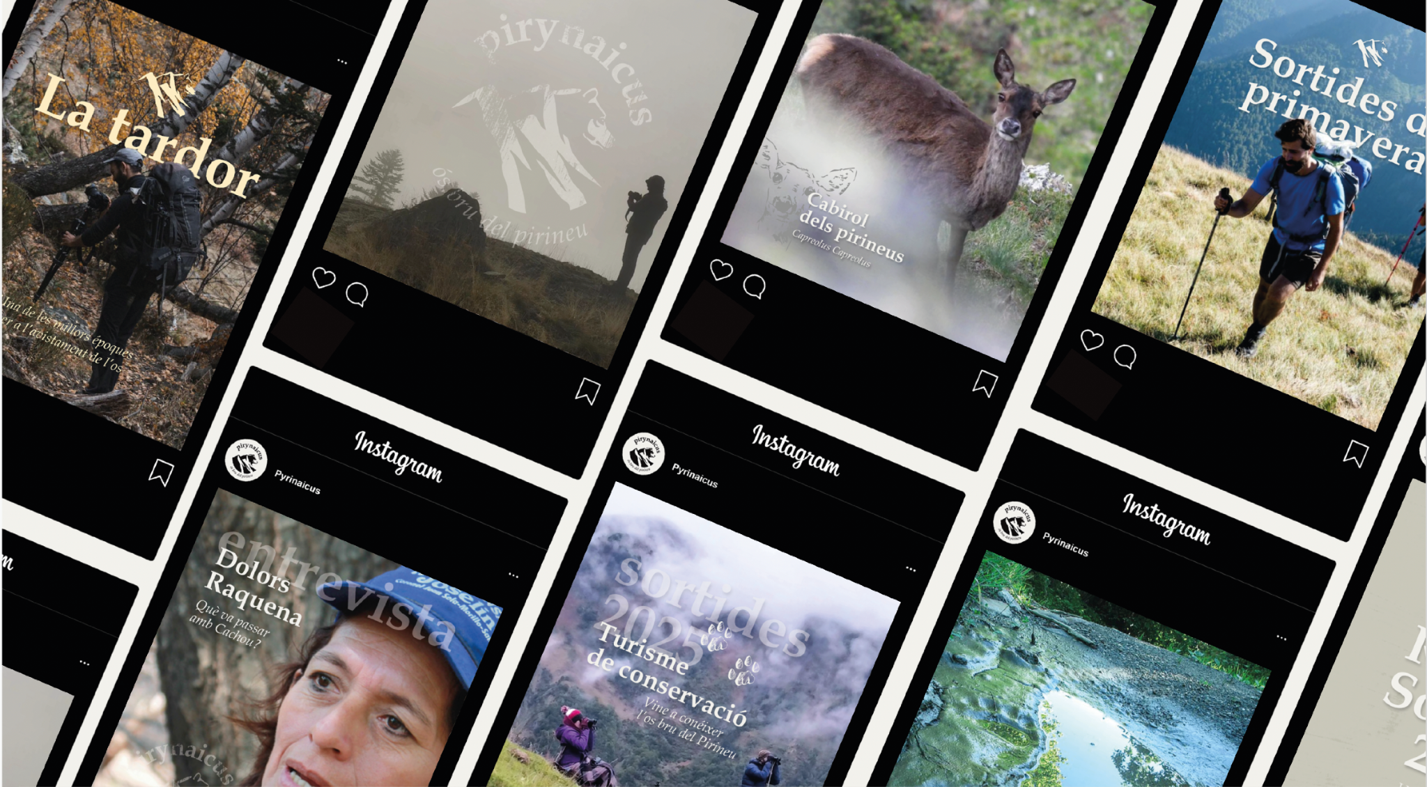
The system adapts to very different content — routes, wildlife, interviews and conservation — while keeping a recognisable voice in every post.
06 — Application
The identity moves
into the landscape.
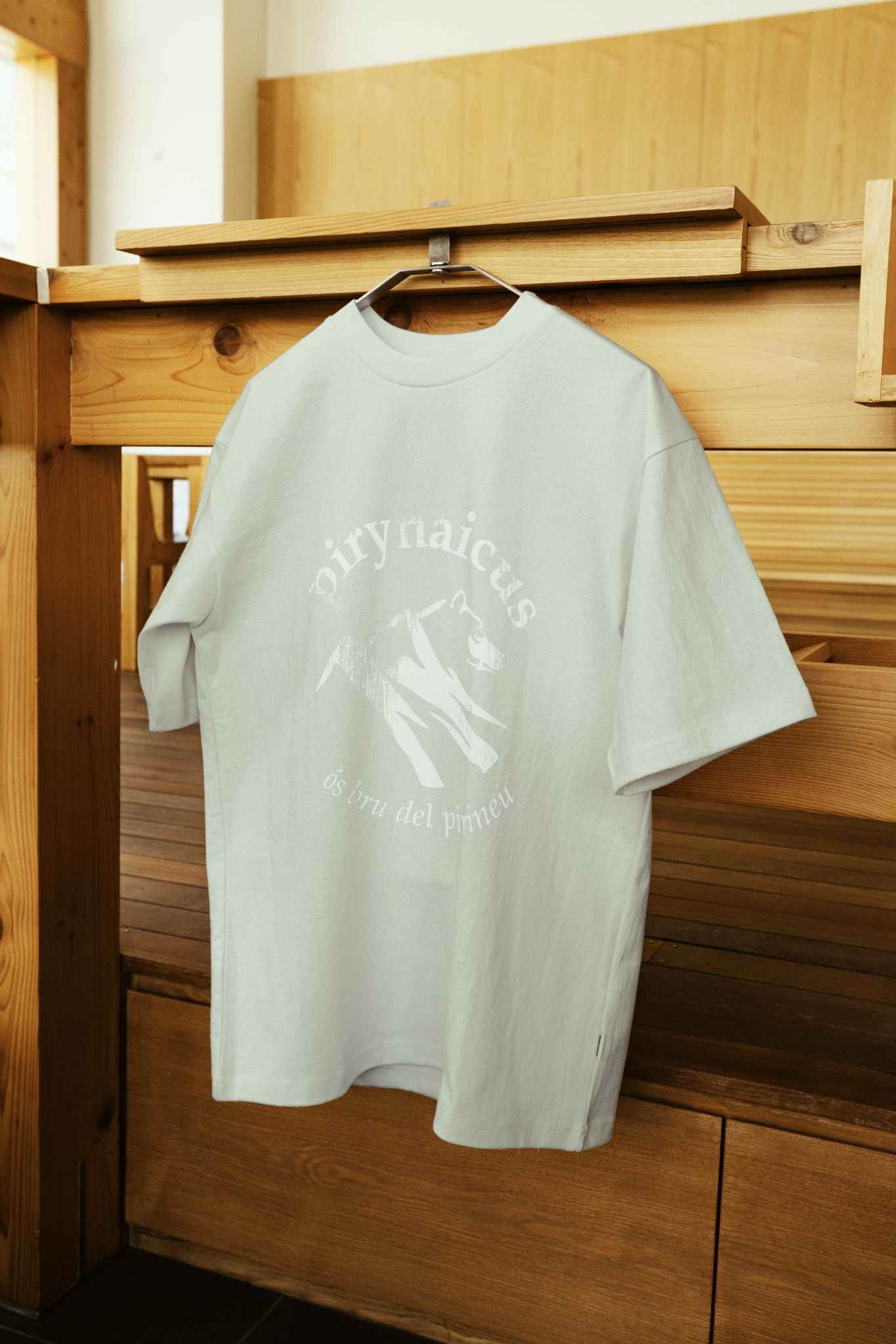
Across physical applications, the brand keeps its quiet, tactile character and becomes a natural extension of the experience.